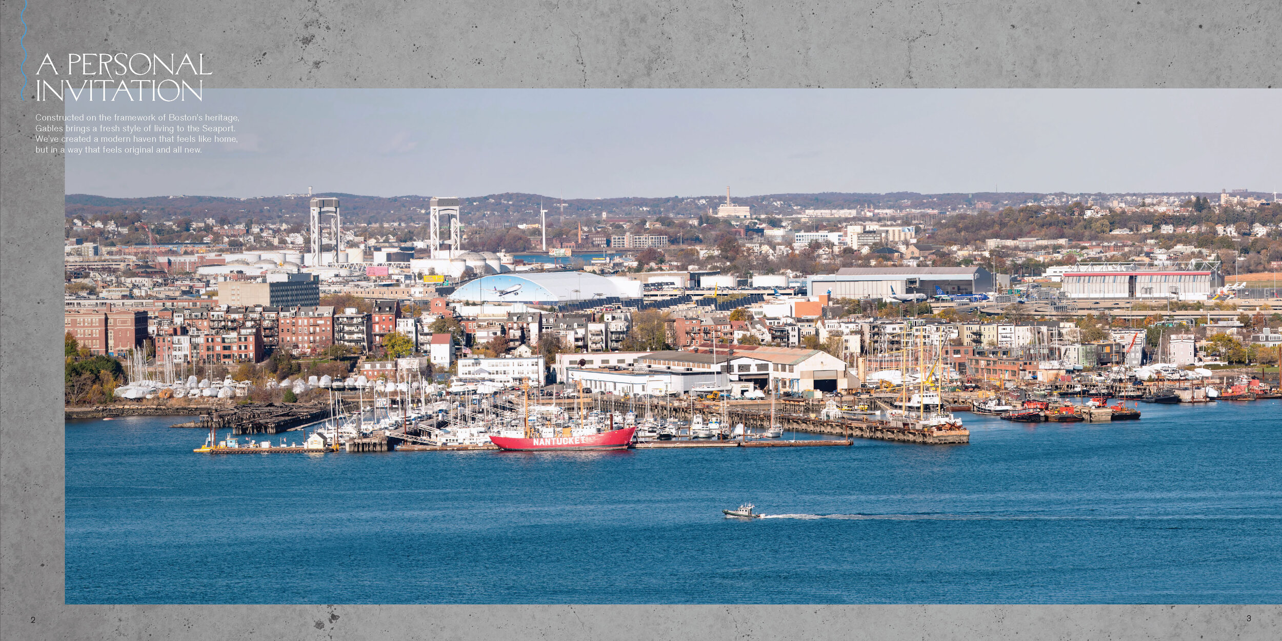


the boston of the past, today
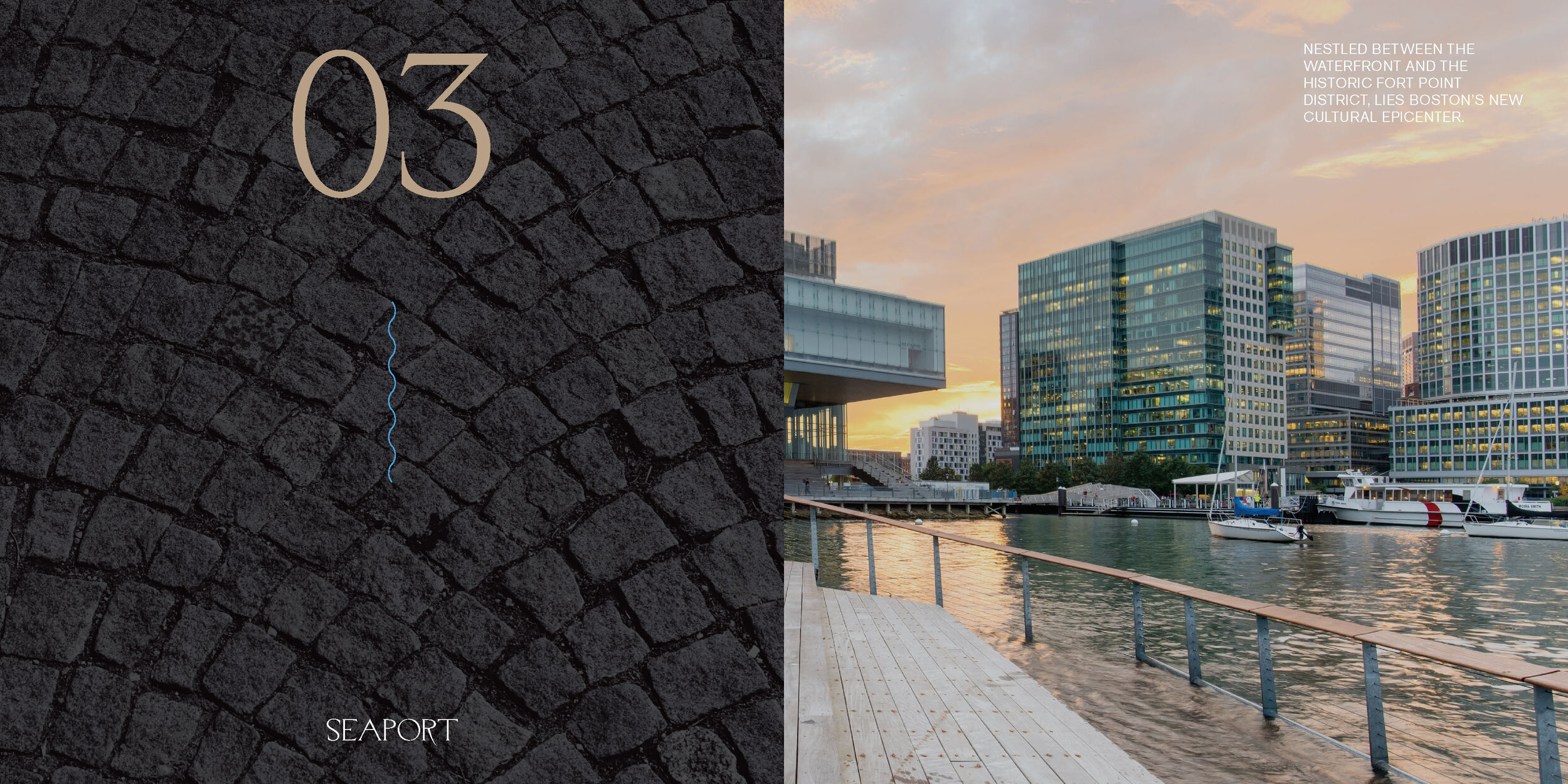
Gables Seaport is a high-end rental property located in the emerging, newly-developed area of Boston—The Seaport. This vibrant neighborhood is known for its trendy pop-ups, established start-ups and popular bars and restaurants.
In wake of their new residential development, Gables approached us with the task of creating a branding and advertising campaign for the young, passionate professionals the space attracts.
Inspired by the nautical roots and rich heritage of Boston, Gables Seaport embraces modernity while holding onto its confident, down-to-earth origins.
“+ Art Direction
+ Print Production and Design
+ Branding
+ Web Design
+ Ad Campaign”
The challenges
Not Another White Box
From the beginning of this project we identified two main hurdles—the first, in a familiar phrase was: “setting ourselves apart from the competition.” Fortunately, the interiors provided a valuable advantage in this scenario.
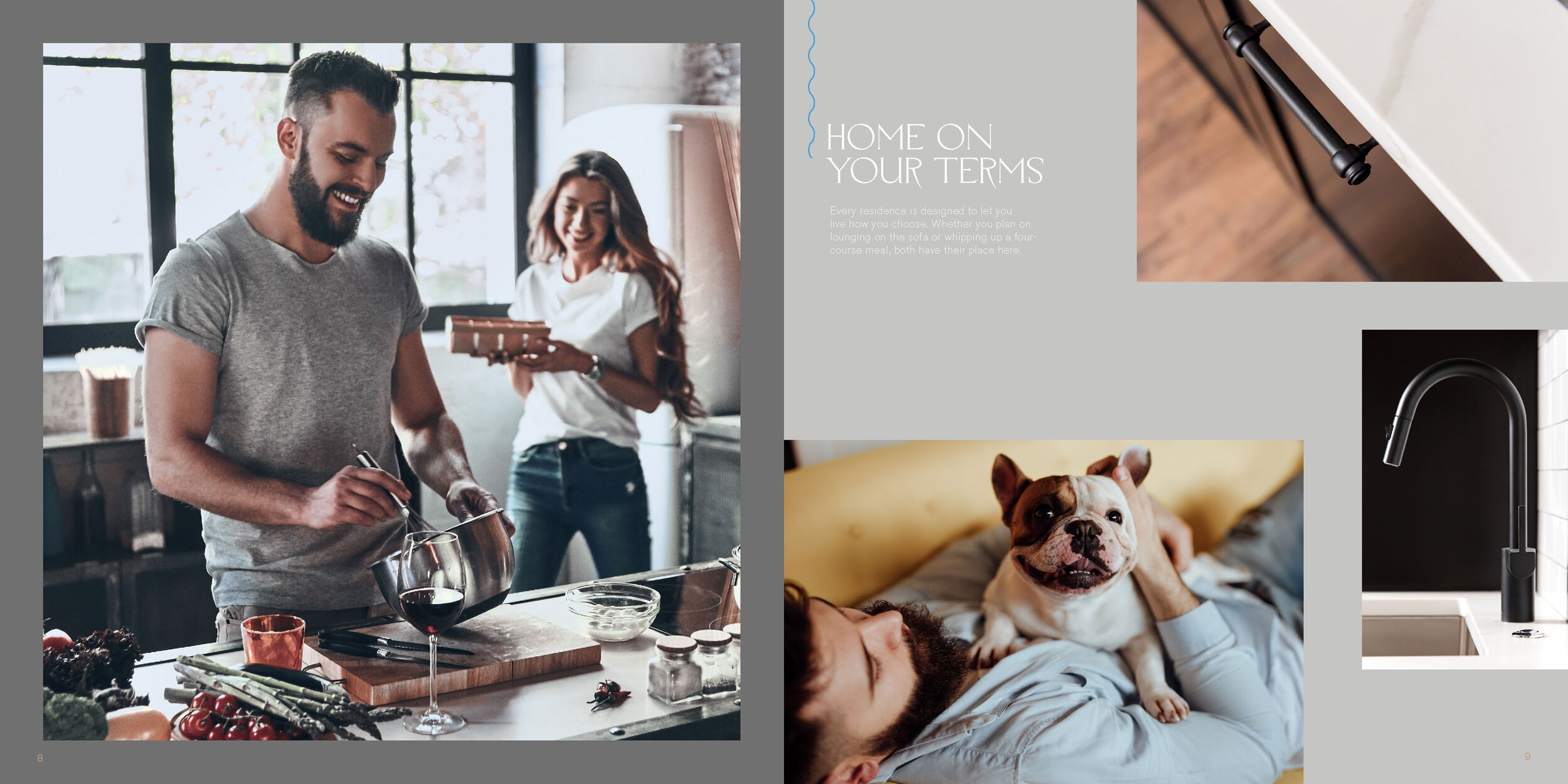
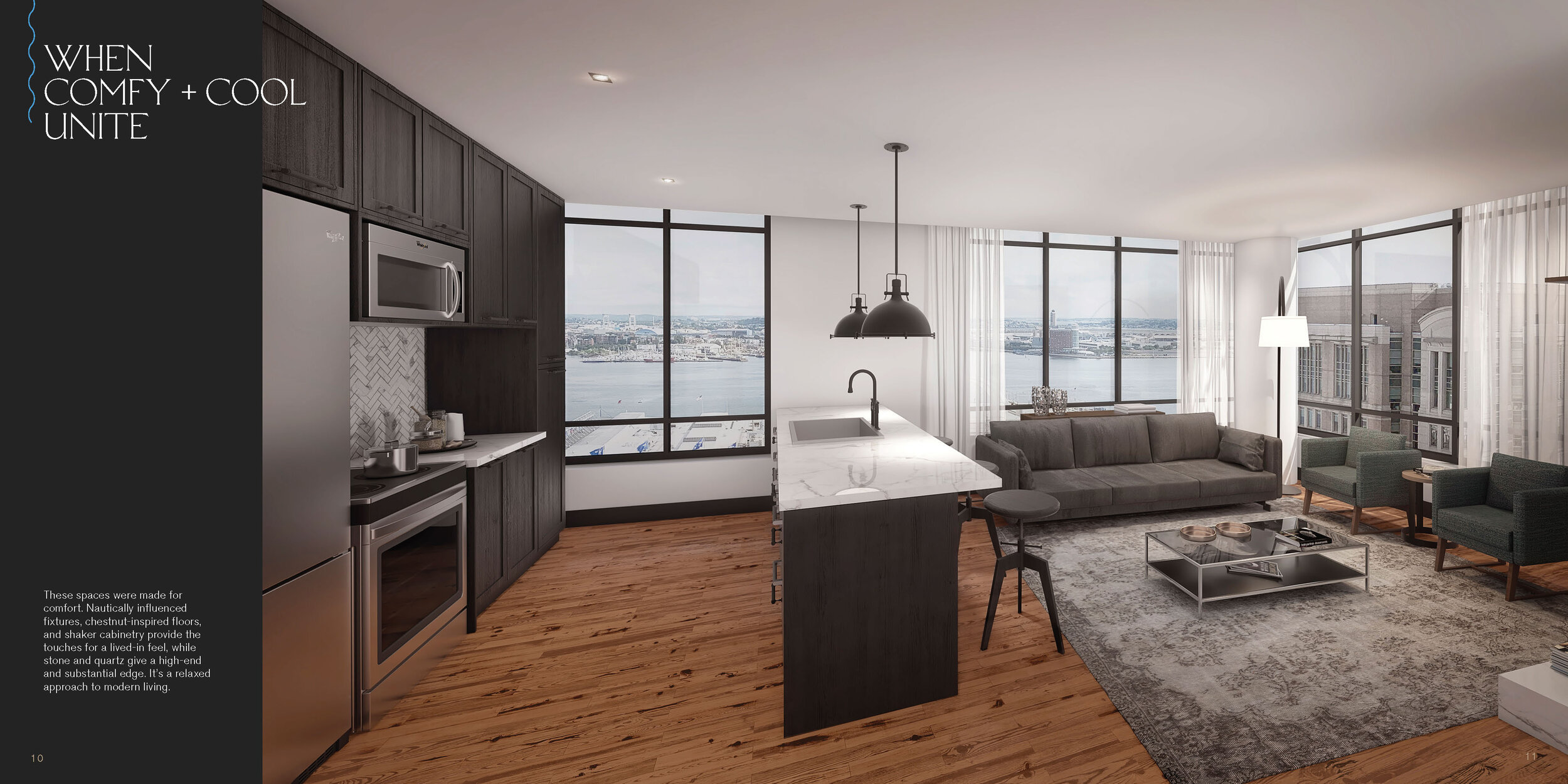
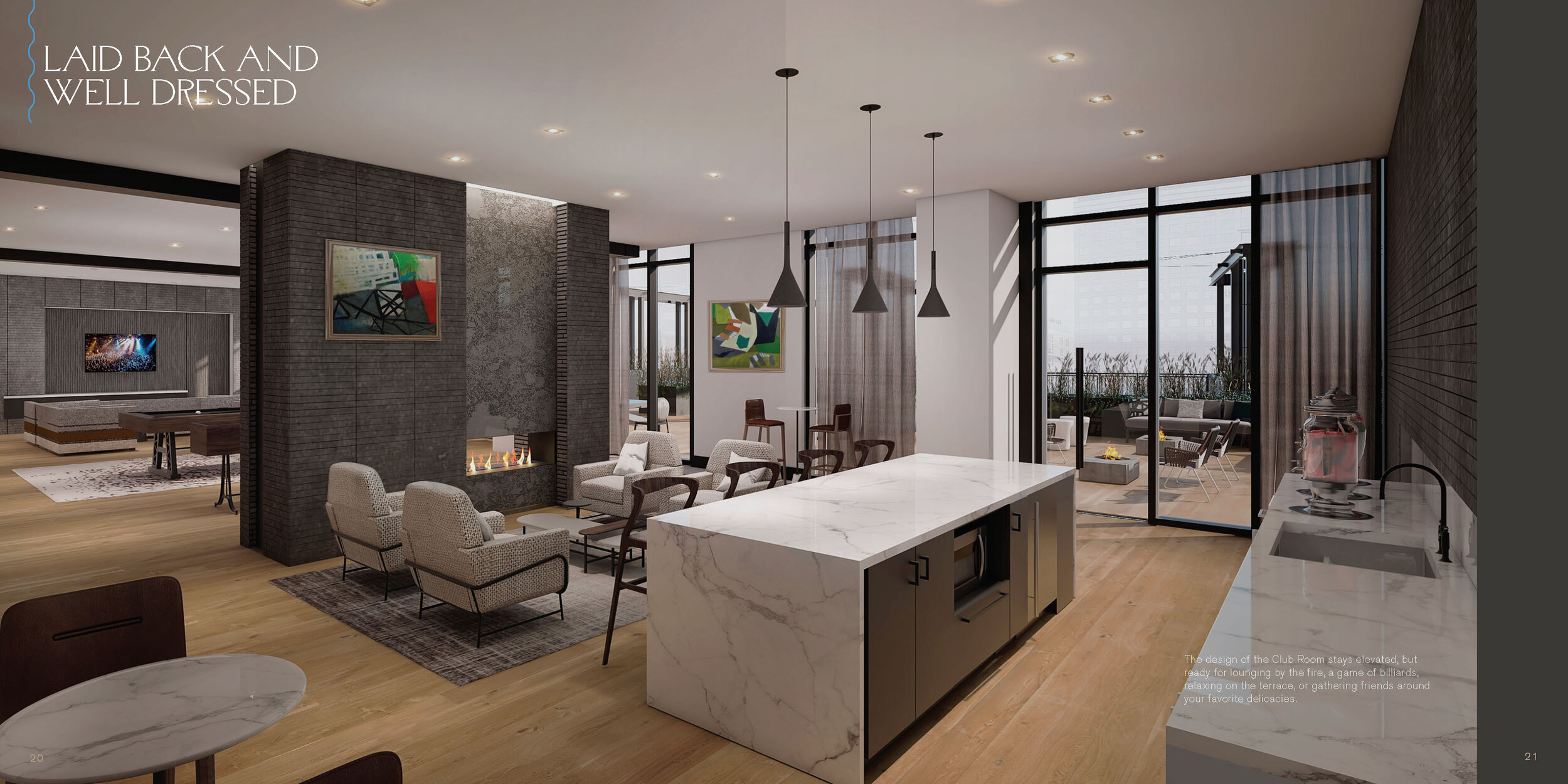
Many of the prospective rentals in Seaport are modern—very modern. White-boxes-with-spaceship-technology-modern. Not very approachable. We chose to emphasize the warmth, humanity and materiality of these homes as a point of distinction throughout all elements of the brand.
Gables Seaport is a place in which you can actually live your life.
TACTILITY
The second hurdle we identified was that we would not be able to alter the already-established Gables mark and lockup.
Knowing our extremely particular and brand-astute young audience we came up with an alternate approach. Instead of dwelling on the logo as the sole signifier, we chose to emphasize distinct textures and additional elements in stationary and collateral. Insuring the experience was not only visual, but tactile.
For Gables Seaport’s collateral we chose a heavy, porous, deep grey stock to embody an industrial look and feel. We then chose to hit it twice with black and grey metallic inks. Giving it a subtle, but notable graphite appearance. We then finished off the pieces with a distinct, vibrant foil-stamp for the logo.
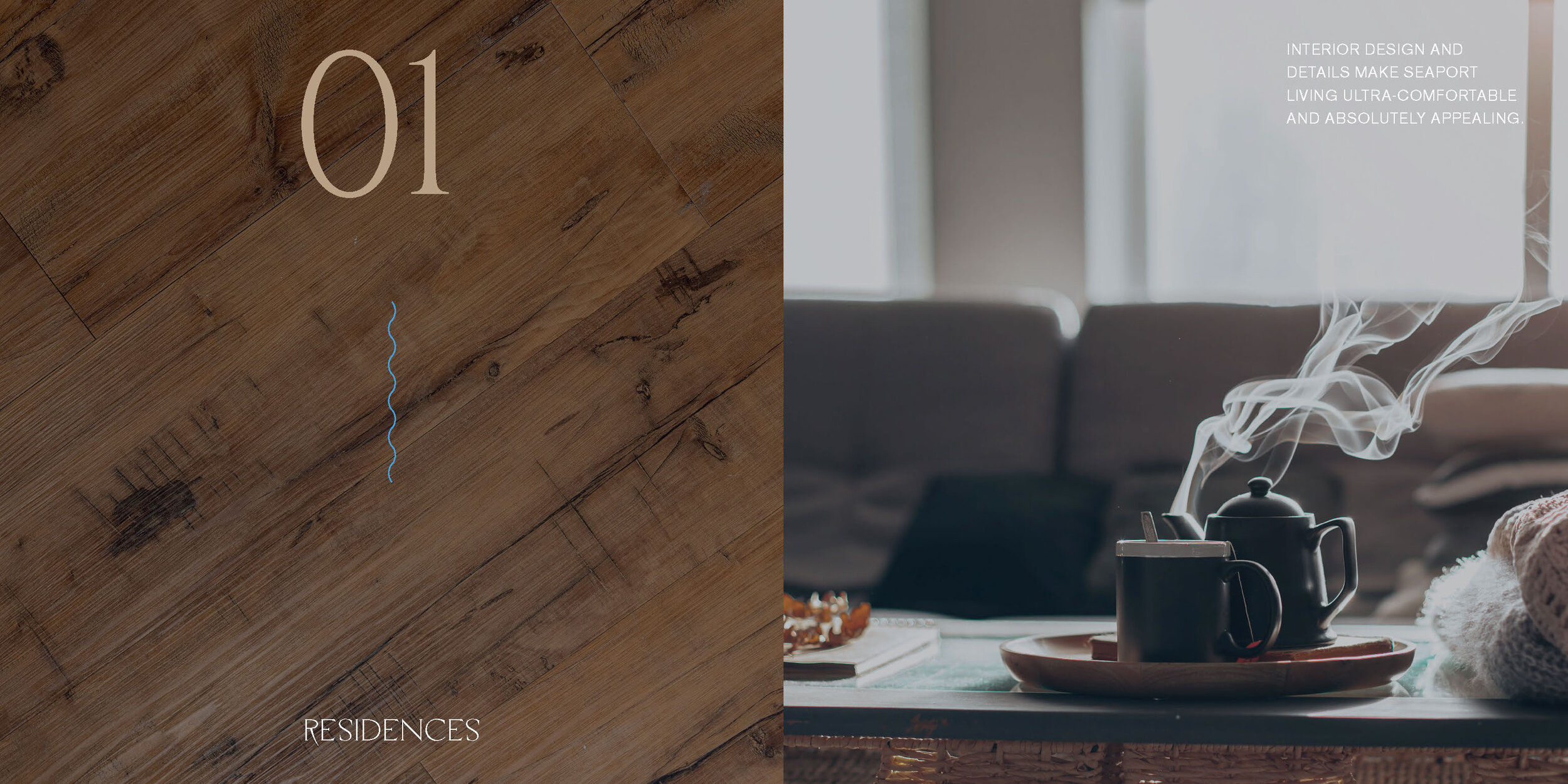
Brochure Interior